Redesigning information architecture for a highly regulated market. And cutting task time by 63%.
Role
Product Designer
Client
CorMedix
Timeline
6 months
Saving your time
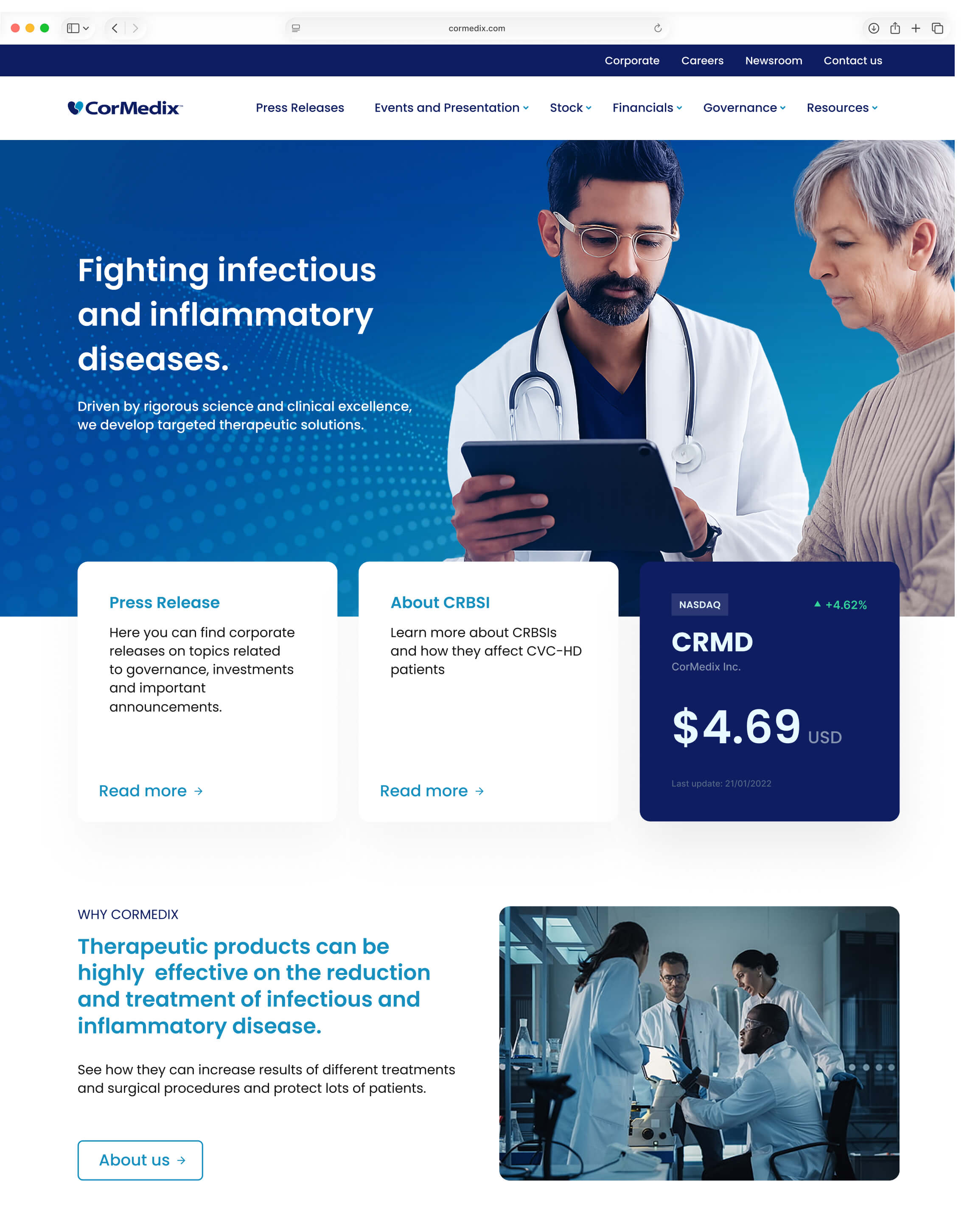
During CorMedix's first FDA filing, a legacy site structure buried critical data, forcing investors to dig for financials and pushing researchers to external search.
I replaced a map organized by internal departments with one driven by user tasks, creating direct bridges between the product and its clinical evidence.
Grounded in market precedent to align risk-averse stakeholders, the new architecture cut task time by 63% in testing and shipped on time.
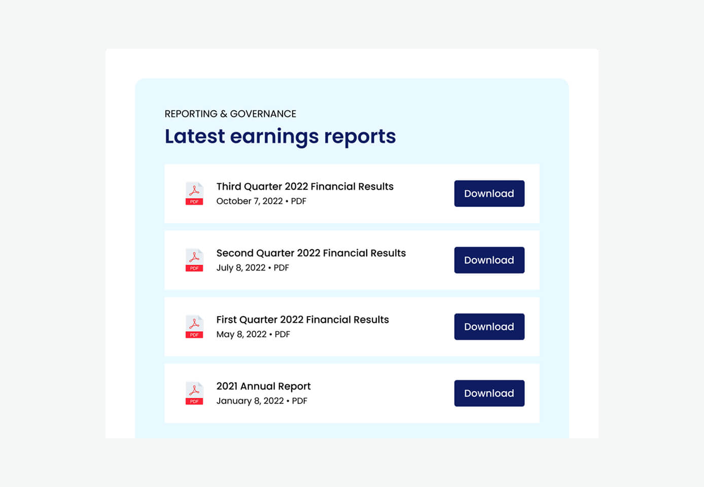
Presentations

The biggest challenge
One map couldn't serve opposite needs.
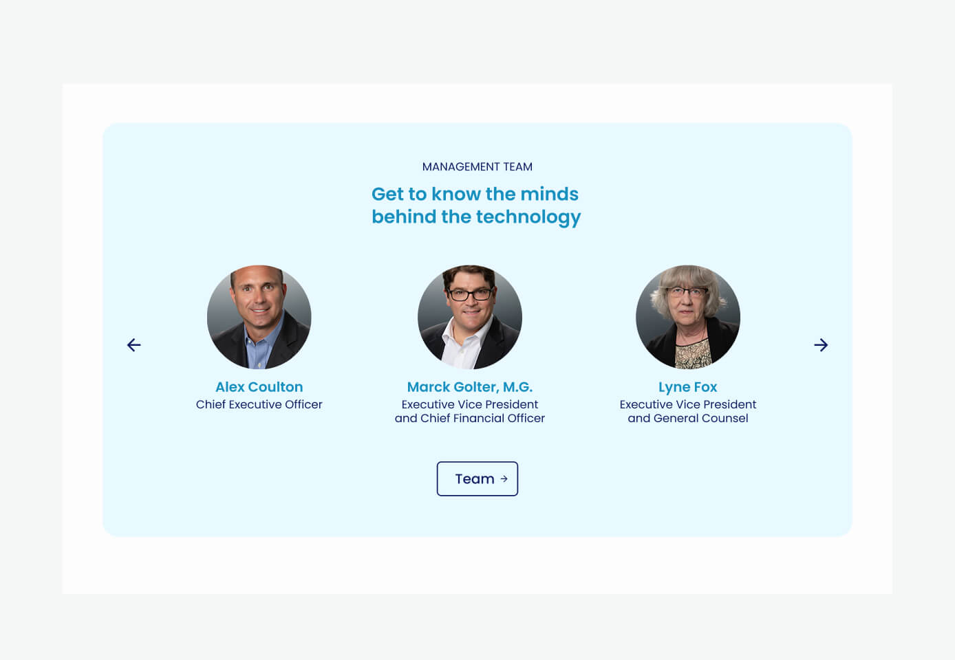
The hardest part of the brief was that the two main audiences pulled in different directions. Investors and press needed predictability and speed to make fast decisions. On the other hand, doctors and researchers needed depth of evidence to validate the science before acting.
A fast decision-maker punished by depth abandons the task, and a careful validator handed only speed loses trust. The same architecture had to serve both without compromising either experience.
Method
Read ten competitors before drawing anything.
I anchored the work in desk research before proposing a single screen. I analyzed 10 listed companies: the five largest on the Nasdaq as a baseline for recognized IR practice, five from health and pharma for domain norms. The point was to argue from precedent rather than taste, which mattered later with Legal too.
9 of 10 portals followed the same navigation model; breaking it would only cost users. 7 of 10 let people filter SEC filings by type and year, where CorMedix dumped a long list with the year barely visible. Only 4 of 10 ran the portal as a live channel. Those gaps became the brief.
Organized by task, not by department.
The legacy structure mirrored internal areas (Company, Partnering, and so on), which forced backtracking and pushed people to external search. I replaced it with a structure organized around what the visitor came to do, not which department owned the content.
Legal's instinct was to block asset downloads to prevent misuse. Blocking degrades the experience and pushes people back to Google, which is how the wrong logo ends up published in the first place. I proposed the opposite: open downloads with a clear disclaimer and correct file names. It protected the brand by making the right asset the easy one to grab.
Before
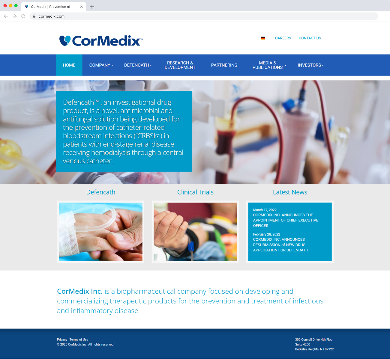
After
The outcome
−63%
avg. completion time across all tasks in the comparative prototype test (64s → 24s).
+30pp
task success rate, legacy vs. proposed architecture (63% → 93%).
Still standing
months later, new campaigns shipped and the underlying architecture never had to change.
Learnings
Elegant solutions, hard boxes. Three things this project taught me about designing something elegant inside constraints you can't remove.
One structure can serve opposite readers
Investors wanted speed and researchers wanted depth, so the split looked like it needed two sites. Task-based architecture, with bridges between product and evidence, let one structure serve both. The comparative test confirmed that call rather than asserting it.
Move risk-averse stakeholders with precedent, not opinion
Legal and IR didn't need a better-looking argument, they needed proof the market already worked this way. Bringing them into the research early turned compliance from a blocker into a shared standard. The download decision made the case: I protected the brand by opening access, not restricting it.
Rank scope against the business's stage, not a competitor's checklist
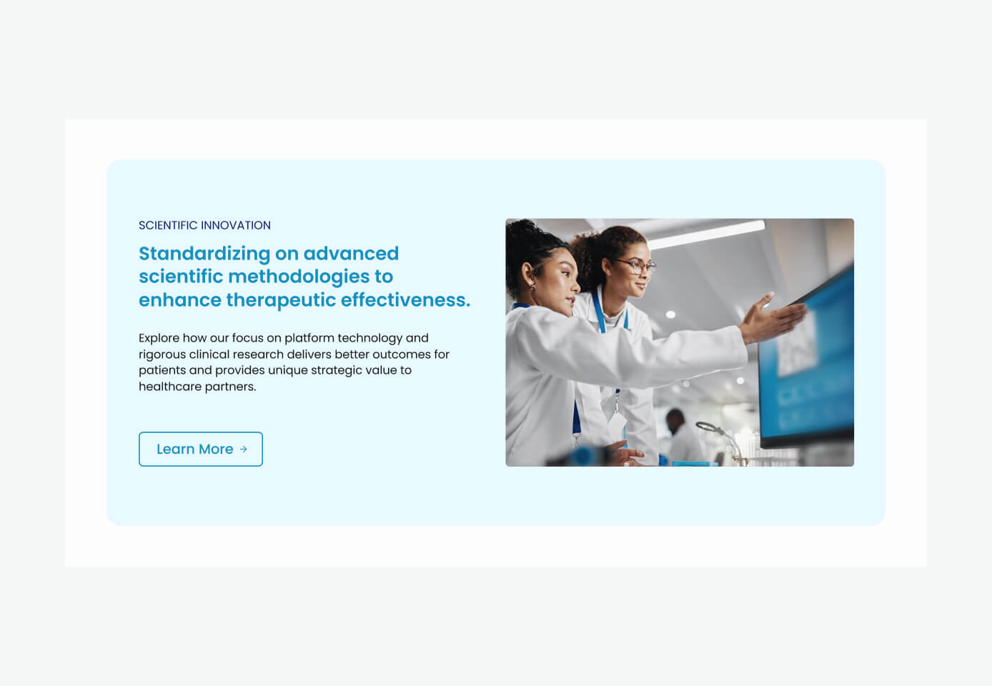
Cutting the multimedia layer for events and presentations was right because the value didn't justify the cost yet, not because it was hard to build. Sequencing discovery and execution kept a sustainable pace across six months.