Based in Sliema, Malta
CORMEDIX
Rebuilding a biotech's investor hub around two opposite readers.
A task based architecture overhaul ahead of an FDA filing.
Prototype testing validated a 93% task success rate and cut completion times by 63%.
Summary
Context
In 2023, while CorMedix filed its first product (DefenCath) with the FDA, the company's legacy institutional and IR site turned into a liability at the most sensitive moment in its recent history. Investors fought through too many clicks to reach filings and reports. Journalists and scientists reached evidence and press kits only by way of Google. Three forces were in tension on every decision: user access, regulatory compliance, and what the internal team could actually maintain.
What I did
A new, task based information architecture.
I replaced a site organized by company department with one organized by what each visitor came to do, grounded in desk research across 10 listed companies.
Validated it before build.
A comparative prototype test (legacy versus proposed) with 14 participants across 6 critical tasks gave the direction measured backing.
Aligned Legal and IR with precedent.
Every recommendation arrived backed by real market examples, so risk averse stakeholders moved on evidence rather than opinion.
Team
Duration
6 months
Technologies
WordPress
Deliverables
Information Architecture · Strategy · Alignment
Responsibilities
UX Strategy · Information Architecture · Desk Research & Synthesis · Stakeholder Alignment (Legal/IR) · Implementation Support (QA + handoff)
Results
Validation before launch
Legacy vs. Proposed architecture. Tested with 14 participants.
−63%
avg. across all tasks (64s → 24s).
−82%
reducing trial and error (56% → 10%)
+30pp
task success rate (63% → 93%).
These figures come from the comparative prototype test, legacy vs. proposed. Due to strict healthcare compliance and the nature of the agency client model, post launch analytics such as traffic, engagement, and conversion are proprietary and confidential to CorMedix's internal team.
Built for autonomy.
Autonomous publishing
Empowering the team to publish, update, and scale content with zero design or dev dependencies.
Post approval roadmap
A strategic backlog to drive the DefenCath rollout and continuously scale the investor hub.
Shipped and handed off
The hub went live in April 2023, ahead of DefenCath's FDA approval that November. I handed over the editable files and took part in the training our tech team ran for the client, so the internal team runs every page and update in WordPress, the autonomy the client asked for from day one.
Post launch: the product in the wild.
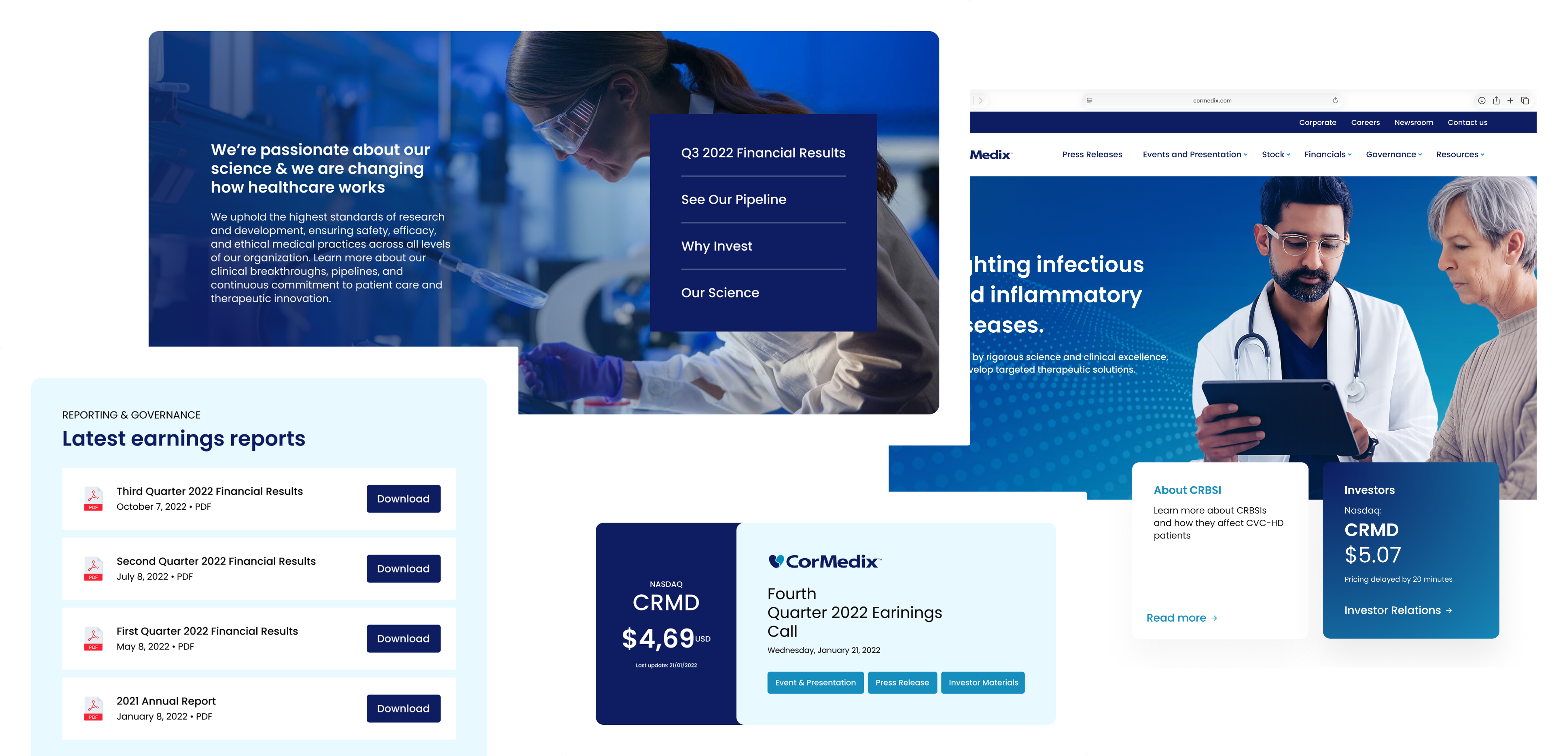
A few months after launch came one of the most critical moments in the company's history: the FDA approval of DefenCath in November 2023, the first and only antimicrobial catheter lock approved in the US.
That milestone put the company in the spotlight, and its media presence scaled with it. Comparing the pre launch period to the data leading up to 2024, the number of organic press mentions practically doubled, excluding official channels like the CorMedix site, Nasdaq, and the FDA. I don't credit this spike to the website alone, but the redesign gave the company a solid, reliable calling card right as it moved from a clinical promise to a commercial reality.
The most telling read comes from the site today. The internal team has heavily evolved the homepage to run patient centric campaigns, a natural shift for a company now selling a product that reduces infection risk by 71%. Yet as you move into the inner pages, the foundation and components we delivered remain intact. The underlying architecture still holds up, supporting everything that came after.
Perhaps that is the truest metric of good foundational work:
it becomes invisible, but it keeps the structure standing.
A liability at the worst possible moment
CorMedix was about to become a commercial company. DefenCath, its first product, was in front of the FDA. For a single product biotech, that filing is the whole story, and every external audience comes to the site to read it.
The site was more than ten years old. It turned critical tasks into trial and error and made a company on the edge of approval look static. Two failures stood out. Investors needed too many clicks to reach reports, filings, and the financials behind a buy or sell decision. Journalists and the scientific community had to dig for clinical evidence and press kits, often landing on the official source by way of Google.
The job was to widen access and transparency without breaking compliance, and keep the result manageable for a small internal team.
That sentence held three forces in tension: the user who wants access, the regulator who limits it, and the operator who has to maintain whatever ships. Every decision had to balance all three, which is what made this an architecture problem before it was a visual one.


Two readers who want opposite things
The hardest part of the brief was that the two main audiences pulled in different directions, and the same architecture had to serve both without compromising either.
| Audience | Mindset | What they need |
|---|---|---|
| Investors & analysts | decide on a position | financial signal, fast: reach the results, filing, and price to judge health, profit, and market, then act |
| Researchers & journalists | build to publish | depth of material: evidence, press kits, and market data complete enough to construct a report or story |
A fast decision maker punished by depth abandons the task. A careful validator handed only speed loses trust. Designing one map that respected both became the spine of the project, and the thing I measured at the end.
Ten companies, read for patterns
I anchored the work in desk research before drawing anything. I analyzed 10 listed companies: the five largest on the Nasdaq as a baseline for recognized IR practice, and five from the health and pharma sector for domain norms. The point was to argue from precedent rather than taste, which would also matter later with Legal.
A few findings shaped the whole design:
9/10
Predictable navigation model
9 of 10 portals follow the same model: news, events, stock, financials and reports, governance, resources. Breaking that pattern would only cost users.
7/10
Filings as a filterable database
7 of 10 let people filter SEC filings by type, group, and year. The legacy CorMedix site dumped a long list with the year barely visible.
4/10
Portal run as a live channel
4 of 10 offer email alerts, and the strongest performers cluster quarterly materials (release, webcast, presentation, transcript) into one group. A live signal reads as a company in control.
Adopted Patterns

Dedicated environment
An isolated hub strictly for investors.

Database over lists
Filtered, searchable SEC filings.
Task driven links
Quick access for repeated user actions.
Embedded activity
News integrated to signal company velocity.
Strategic Tradeoffs & Scope

Navigation
Task based guidance instead of portfolio menus for the single product stage.
User trust
We kept all flows native, refusing third party redirects to maintain context.
Scope control
Removed complex features from the MVP to guarantee on time delivery.
Organizing by task instead of department
The master principle was to organize the site around the visitor's journey rather than the company's org chart. The legacy structure mirrored internal areas (Company, Partnering, and so on), which forced backtracking and pushed people to external search.
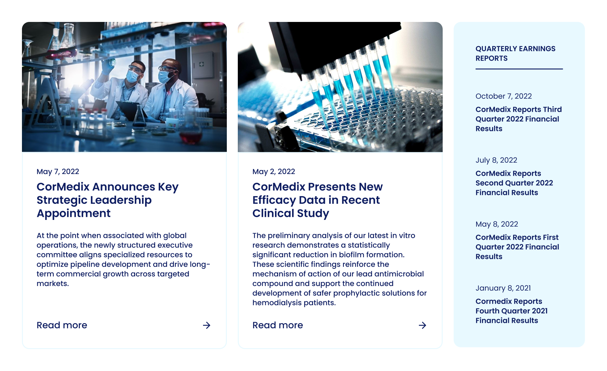
Presentations
The download decision
One call took the most judgment. Legal's instinct was to block asset downloads to prevent misuse. Blocking degrades the experience and pushes people back to Google, which is how the wrong logo ends up published in the first place. I proposed the opposite: open downloads with a short disclaimer, a clear guideline, and correct file names and metadata. It protected the brand by making the right asset the easy one to grab.
Putting the architecture on trial
To validate the architecture, I ran a comparative navigation test (legacy vs. proposed prototype). The two readers show up below as three personas: an investor, a researcher, and a journalist, the last two being the same build to publish reader.
14
participants (6 investors/analysts, 8 researchers/press)
6
critical tasks (4 UX defined, 2 business requested)
5
metrics: success, time, first click, misclicks, SEQ
−63%
avg. completion time, all 14 participants (key finding)
These results were not a postscript; they served as the definitive basis for each specific architectural choice.
“I waste an enormous amount of time navigating tabs and scrolling pages just to pull the filing and the press release for a single quarter. It's exhausting.”
Read these per task as directional, not definitive. With six to eight people on each task the samples are small, so no single delta proves statistical significance. What matters is that every one of the six tasks moved the same way, faster, more successful, and easier to use. That convergence is what I trusted to back the architecture.
Disarming risk with precedent
On a project where compliance was one of three forces, the stakeholders were part of the design problem. I put Legal and IR inside the desk research from the start, so by the time recommendations arrived they already shared the evidence base.
Every recommendation came backed with real companies: screenshots and notes showing the pattern in the wild. A risk averse audience does not move on an aesthetic argument. It moves on “7 of 10 companies in your sector do it this way.” Precedent reframed each decision from one designer's opinion into an observed market standard.
You move people who think in risk with proof of the market rather than taste.
Regulatory alignment itself ran smoothly. The client supplied legal content already approved as PDFs, and US disclosure rules sit lighter than the Brazilian norms I came from, so compliance never became a blocker. What carried over was the method itself: every call backed by precedent, ready for the next project where the rules run stricter.
Cutting parity that did not pay yet
Competitors had a full multimedia layer inside events and presentations: webcasts, an in browser presentation viewer, a video repository, and audio only downloads. It was the most visible gap against the field, and the obvious thing to chase for parity.
I cut it from the MVP. The reasoning was about the company's stage rather than the feature's quality. CorMedix was listed but not yet FDA approved, which meant low traffic and few reports. The infrastructure would take significant time and content to build well, and it carried little near term value: investors already understood this was a company with recent commercialization and no back catalogue of media to show.
Strategic note: cutting features was a deliberate decision. The company's stage was prioritized over following a competitive checklist, keeping development focused on what would bring immediate value to investors.
Scope Map: MVP vs. Roadmap
MVP Scope (Immediate Launch)
Delivering what is essential for the company's current stage and guaranteeing immediate financial transparency.
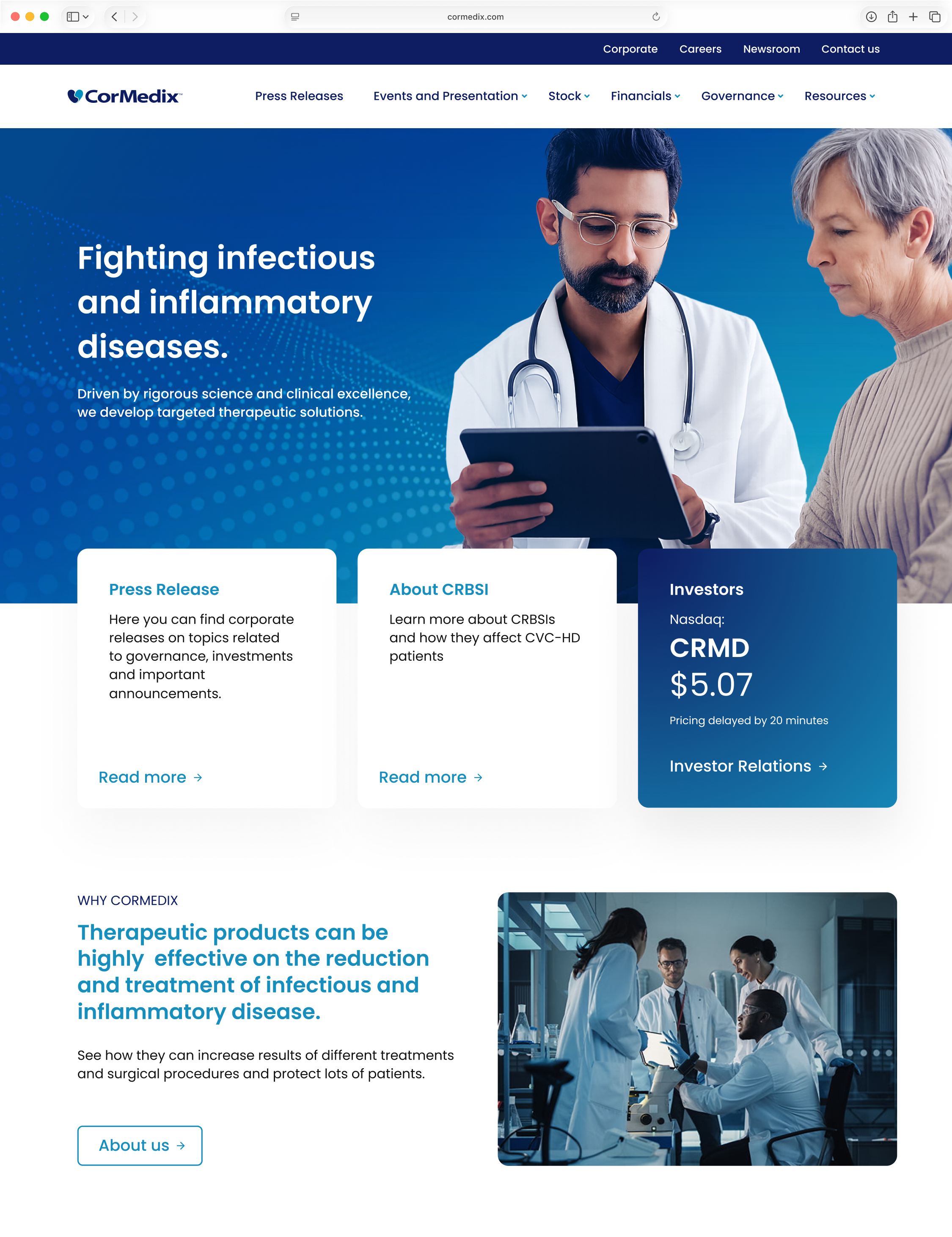
Financial data
Cross referencing each quarter’s results: the quarterly numbers paired with their earnings Press Release (e.g. Q3 ’22).
Mandatory documentation
Direct access to clinical trials, 10-Q reports, and 8-K filings.
Market data
Widget with real time stock price and daily change.
Engagement
Clear Email Alerts subscription.
Post Approval Roadmap (Deferred for Growth)
Complex features removed from the MVP to avoid unnecessary cost and protect the launch deadline.
Multimedia content
Live webcasts and a video repository.
Visualization
In browser presentation viewer.
Convenience
Audio downloads and an investment calculator.
What the project really turned on
Three things hold up after the fact, and none of them was a screen.
One map can serve opposite readers if you organize by task. The biggest lesson was balancing audiences with nearly opposite needs: predictability for investors and analysts, depth of material for researchers and journalists. Task based architecture, with bridges between product and evidence, let one structure serve both, and the comparative test confirmed it rather than asserting it.
Precedent is how you move risk averse stakeholders. Legal and IR did not need a better looking argument; they needed proof the market already worked this way. Bringing them into the research early and backing every call with real examples turned compliance from a blocker into a shared standard. The download decision is the clearest case: I protected the brand by opening access rather than restricting it.
Mature prioritization is ranked against the stage of the business. Cutting the multimedia layer for events and presentations was the right call because the value did not justify the cost at that point in the company's life. The effort was real, but it was weighed against near term value, not avoided because it was hard. Sequencing delivery into discovery and execution sprints kept a sustainable pace across the six months.
One thing I would tighten next time: framing the metrics. The numbers are strong, and they are prototype test results. Stating that plainly is what makes them credible, and it is the standard I hold every measured claim to now.